 When it’s great, store lighting tends to go unnoticed. But when something is wrong with your lighting, it can easily throw off the atmosphere of your store, making things look dull and boring. Unfortunately, many retailers neglect lighting. Not only is it a critical component of your store’s image and brand, it can also account for a substantial portion of your utility expenses. Here are a few things to remember to get your store’s lighting right.
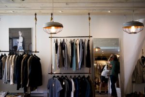
1. Layer Your Lights
At its core, retail lighting is composed of accent lights and ambient lights. Accent lighting is used to add drama and flare to the space while ambient lighting is used for general lighting. Mix and match these layers to fit your shop’s look. Keep in mind that your ambient lights should not be too bright that overpowers the accent lights, which highlight your merchandise.
2. Lighting Should Match Your Branding
As a store owner, you need understand that your identity transcends your logo. How you present yourself to your customers should match your business’s branding. The same applies to your lighting.
How your store is lit might seem like a small detail, but it has a huge impact on the customer experience. For one, your fixtures and lighting setup should match your brand’s image and values. A general rule to remember is that customers often associate accent lights with up-market brands and ambient lights with low cost brands. So, don’t be afraid to use accent lights to highlight your product displays.
3. Choose Between Warm or Cool Lights
Color temperature is the key to setting a store’s look and mood. Light bulbs with a cool color temperature (ranging from 4000K to 6000K) generally attracts a younger demographic and gives the area a more spacious and lively look. On the other hand, light bulbs with warm color temperatures (ranging from 2700K to 3000K) create a homier and familiar mood that tends to appeal to older or up-market clients.
4. Understand the CRI
The Color Rendering Index (CRI) is the index used to gauge how accurate colors appear under a light source. For example, how red an apple looks under a light bulb. Now, many people believe that the higher the CRI of a light bulb, the better colors appear under its light. But this is not always the case.
Colors have specific values in the CRI. For example, R9 is the value for red. If a light bulb has a high R9 value, then reds will appear richer under its light. For blue, it’s R12, yellow, R10. You can find the color chart online and check the bulb’s packaging for further details.
5. Use your windows
Natural sunlight will always be the best type of light, especially when it comes to commercial use. Apart from using sunlight to highlight your merchandise and entice window shoppers to come in, make the most of your windows by keeping them clear of obstacles like curtains or blinds. If you must add a stencil of your logo on the glass, it’s best not to cover the entire window and allow people to see what’s inside your shop. The light inside your store can also attract customers, so let some light shine through.
Follow these tips to have picture-perfect lighting in your store in [city]!
![Overhaul School Finances With LED Bulbs [city]](https://8blocks.s3.amazonaws.com/eepros/blog-images/2014/10/libraryled-300x187.jpg)
![3 Tech Solutions You Will Need to Automate Your Home Lighting [city]](https://8blocks.s3-us-west-1.amazonaws.com/eepros/2020/social.jpg)
![The 4 Big Commercial Lighting Trends of 2020 [city]](https://eepros.com/wp-content/uploads/2020/03/business-people-1572059_640-300x200.jpg)
![Is It Safe to Buy LED Light Bulbs From Lesser-Known Brands? [city]](https://8blocks.s3.amazonaws.com/eepros/blog-images/2016/04/leds-bulbs_Fotor-300x199.jpg)